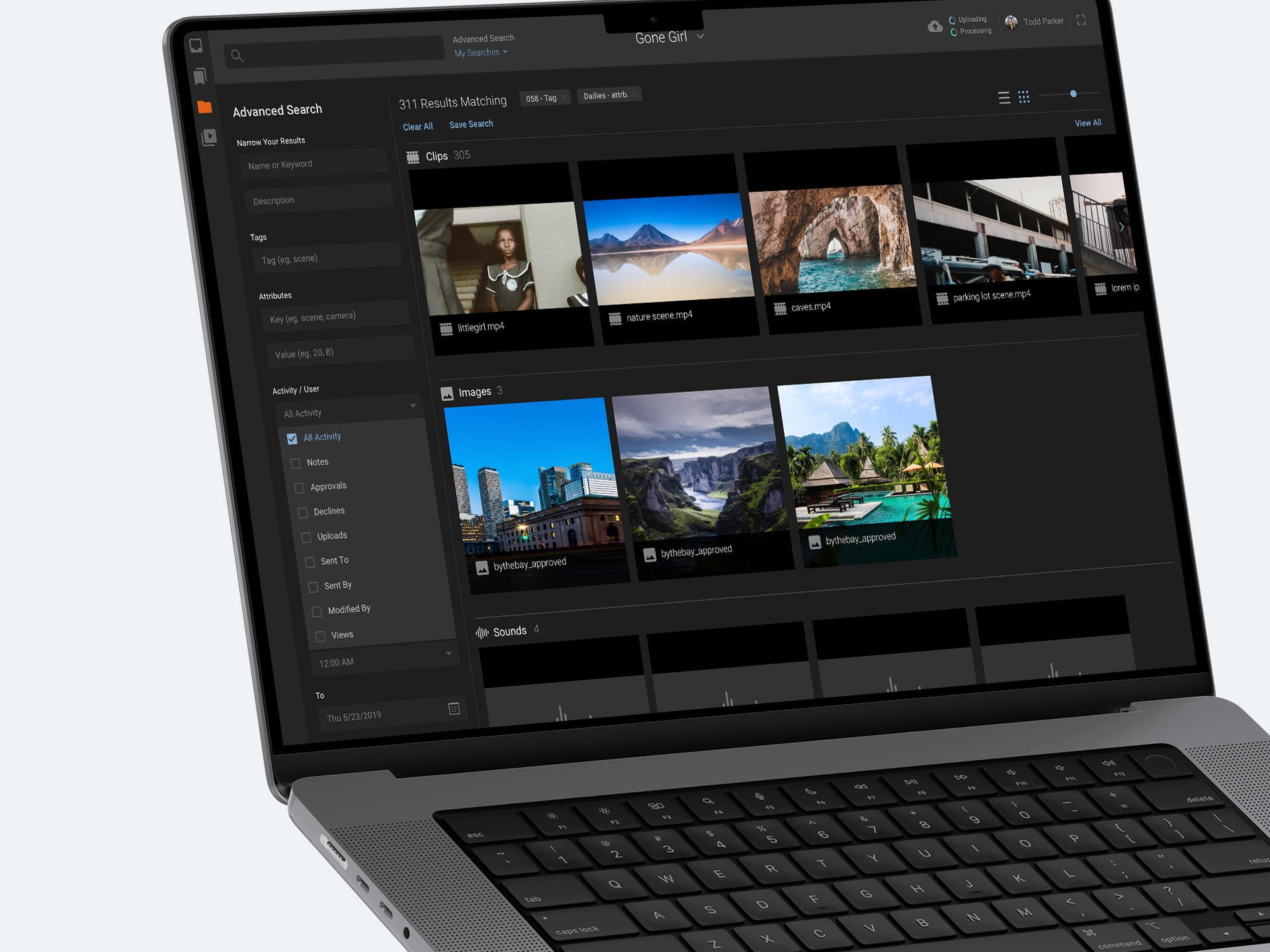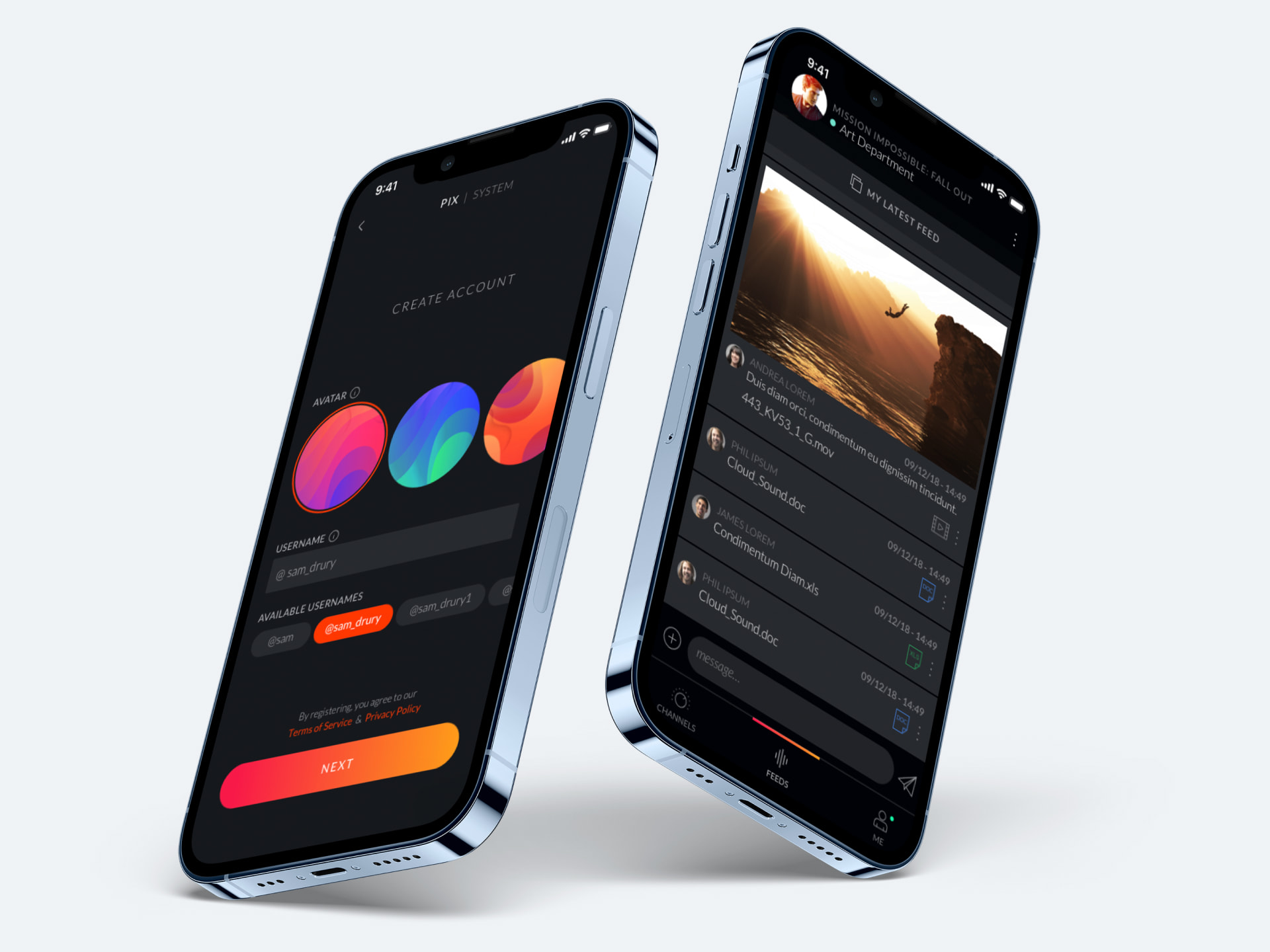

- User research & interviews with directors, producers, art directors
- A total UX and UI redesign across web, mobile & TV
- Restructuring technical architecture
- Modernising a legacy codebase
- Migrating from Angular to React
- A three year collaboration
Heard of Pix? Unless you’re a film professional, probably not – but this production management powerhouse helped bring some of your favourite movies and TV shows to the screen; Spiderman: No Way Home, Squid Game, Top Gun: Maverick, Disney’s Mulan, to name just a few. Pix is an industry-leading production management platform built for creative collaboration, without less admin. Leading movie studios, directors and producers use Pix for remote access to pre-prod. and production content that brings creative teams together with a suite of collaborative tools.
Although loved and respected by movie producers the world over, over time its products had become outdated, hindered by technical debt and slow development. Regular feature updates had all but stopped and its loyal fan base turned frustrated. Partnered with a degrading user experience, this became a major driver for change whilst new competitors began emerging and taking up a larger piece of the pie.
So, Pix came to UIC Digital for a makeover – a total redesign and rearchitect of its platforms, and refresh on agile ways of working within UX and UI. Pix needed a next-gen level up that would see off the competitors nipping at its heels and dominate the space, and we would provide it.
A crowd-pleasing redesign

Our approach was user-centric, bringing in new designs that we knew users would love – because we asked them. When you’re creating a product for a unique set of specialists, it’s crucial to understand exactly what they need. To develop a deep understanding of how a film professional prefers to work, collaborate, create and edit. We ran a series of workshops, product sessions and user interviews to identify and prioritise the workflows and feature requests that mattered to them. Then, using our experience and client feedback, we used this as a foundation for rebuilding Pix’s usability, functionality and, ultimately, its reputation for being great value.
With this under our belt, we began wireframing and creating prototypes. Again, we sent these back into user testing, with feedback harnessed to optimise the designs and constantly refine. It formed an evolving, iterative process that helped to land Pix at the core of what a film professional needs, whether you’re a director, a sound designer or a VFX artist. It placed the audience at the heart of the project, its community integral to the outcome. And when the community is small, tight-knit and dominated by word of mouth, that means a lot.
This is based on our fundamental belief that products should be designed for the user, not for the designers or the technology. Real people first.
Facing down the plot twist

Of course, no plot comes without a twist. We ran into several obstacles that needed to be overcome. Firstly, Pix had never worked with an outside agency before. So, we gradually introduced new ways of working over time, giving internal teams at Pix to learn and lean into it. For example, UX and design was previously seen as one combined discipline at Pix, but the team recognised the need to separate them out. This meant a change to the roles and structure within the team. With us as their guide, they were happy to shift.
From a technical perspective, the challenge was to switch away from a monolithic codebase in Angular to an updated architecture and framework in React. This needed a smooth transition that wouldn’t interrupt service to existing clients. We first analysed the existing codebase for limitations and dependencies, before breaking it down into smaller chunks that would work within the new React architecture.
Working extremely closely with Pix’s internal developers, we migrated the system over one module at a time whilst maintaining backward compatibility and feature parity. As our UI components were designed to be modular and reusable, it meant separating the view from the business logic. The code was then also refactored using modern Javascript syntax and best practice.
The iOS app was also redesigned and technically overhauled. After linking up with user research to identify its key needs, we based a new architecture on modern iOS dev concepts like modularisation and reactive programming. Similarly, we broke down the app into smaller, bite-sized chunks that could be developed, tested and deployed independently. We also used a reactive programming paradigm using RxSwift, for easier handling of asynchronous events and consistently responsive UI.
The upgrade thoroughly brought Pix into the modern age.
Back in front of the lens
The overall results lit up the room. With this redesign, products were given a new lease of life and greater features, like a custom-built video playback, review and edit tool that gave editors multiple playheads and side-by-side playback. Pix customer satisfaction shot up, delivering greater value, an enhanced user experience with new features released regularly. The competition? Didn’t make the cut.
The project shows how design that puts users at the core of everything it sets out to achieve, ultimately wins more customers in the end. Pix is back in the spotlight, the modern age and now continually innovating in the space, now and in the future.
That’s a wrap.

