
- Total UX design overhaul
- Multi-platform relaunch
- User research en masse
- Iterative test and learn approach
- Deep user testing
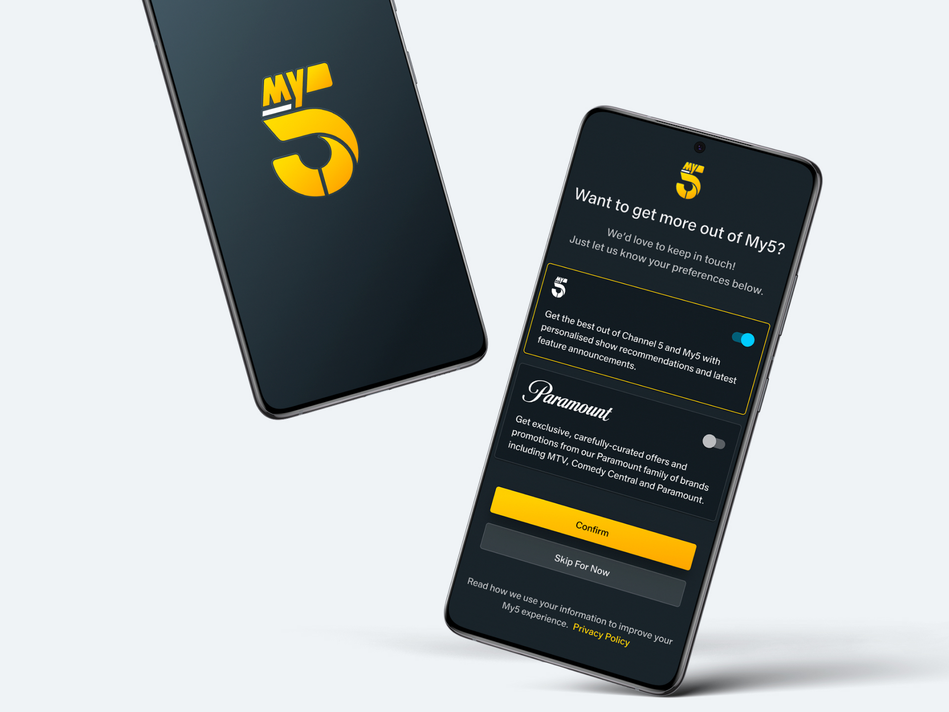
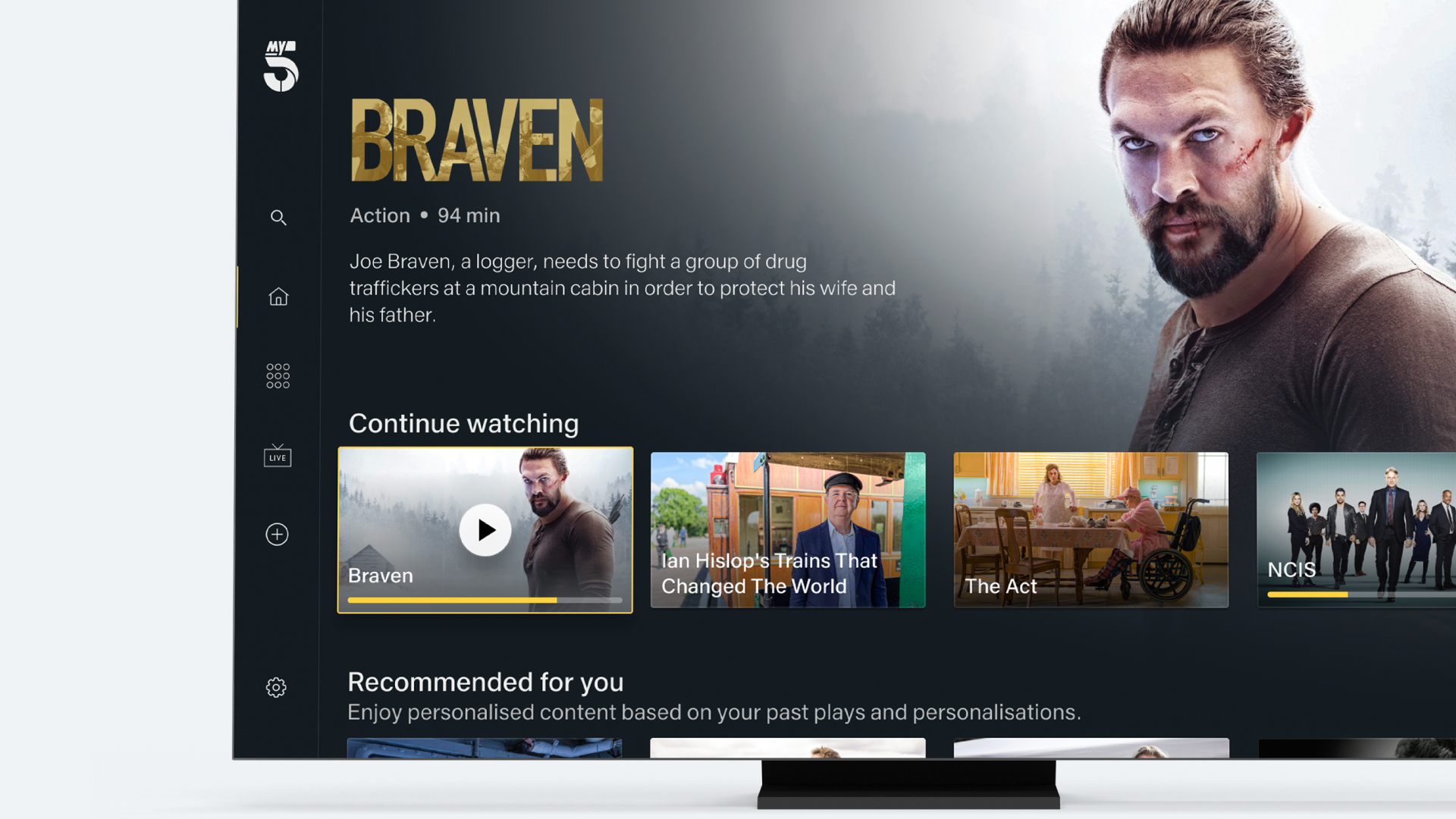
With video-on-demand swiftly becoming the viewing platform of choice for consumers up and down the UK, Channel 5 badly needed to whip its service into shape. With a total rebrand in motion, the all new My5 needed a UX design overhaul from the inside out, guided by its viewers.
Around half the total population in the UK use video-on-demand (VOD) to stream their favourite TV shows. So popular are streaming services that the VOD market is projected to grow 7% by 2027, with linear TV – live shows on the box – falling rapidly.
With strong competition from the likes of Netflix, Amazon Prime, Channel 4’s ‘All 4’ and the Beeb’s ‘BBC iPlayer’, Channel 5 was getting left behind. It came to UI Centric for help with a total rebrand, turning its outdated ‘Demand 5’ VOD platform into the all new ‘My5’ – which we’re sure you know (and love) by now.
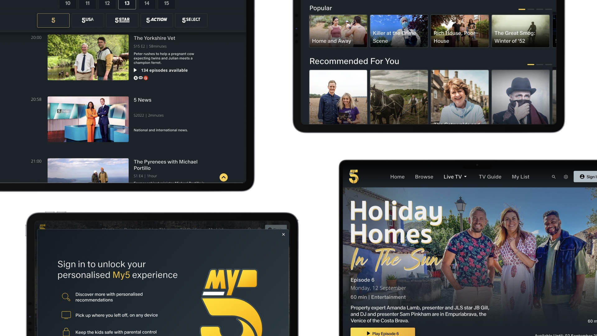
With this major rebrand came the opportunity to gut the inner-workings of Channel 5’s existing streaming platform. Disjointed, inconsistent, old and clunky, it left viewers frustrated by a poor user experience (UX) and hampered any meaningful improvement. Channel 5 asked us to wipe the slate clean, integrating new smart TV and mobile apps, a website redesign and a back-end update into My5. The big picture? Increase viewing numbers, advertising revenue and overall user satisfaction.
Watching viewers watch us

Channel 5 initially asked UIC Digital to focus purely on redesigning its Roku platform. However, this soon grew to bringing the entire suite of Channel 5’s apps and website in line with My5, based on the success of our team’s technical excellence and user-focused expertise with Roku.
Our approach was to make sure the entire project was rigorously user tested and entirely based on user research – from real people, up and down the breadth of the UK. This stretched from running individual user interviews to mass research projects involving 10,000 people. Some people like to watch on mute, others from bed or on a second screen. So we wanted to understand exactly what viewers needed from a VOD platform, to learn about their viewing habits and use the findings to make key design decisions. We also turned up the volume on market research, using listening and competitor analysis to set benchmarks for viewer expectations.
Once we’d run an in-depth technical audit of the platform, our UX design team began in earnest. Working with Invision prototypes, we created a fake living room in our offices, so we could bring in viewers to road test and validate every design iteration, then feed it back into the next round. We then launched products in a series of stages – MVPs that would be constantly built upon – moving from a basic VOD platform to adding in live channels, like Milkshake.
Throughout all of this, every round would sit in front of groups of users, constantly stress-tested and scrutinised, with bright ideas wrapped into the next round of features and functionalities – like adding ‘Live TV’. Although, clearly, revenue was an important factor for Channel 5, our design approach put the viewer first, it gave them a voice. We believe, if you do this, success will always follow.
Back to the cutting room

Of course, a project like this doesn’t come without a few mountains to climb. Today’s VOD viewers have incredibly high expectations – with services like Netflix to compare to – and these expectations also change all the time, as the market evolves. Equally, Channel 5 itself has a vast network of stakeholders, each feeding into the vision and bringing with them many moving parts. The refresh also needed to cater to everyone and anyone in the UK, including best practice accessibility requirements. So we did bags of UX testing, on text size, legibility, structure, with those who had poor eyesight guiding the way.
But, above all, Channel 5 had an old CMS and a huge library of existing content that needed integrating into the new designs in a logical and rational way. When the old system is a dinosaur, that’s a little scary. Of course, Channel 5 had to make changes to their existing systems to make this happen, namely its configuration service and APIs for video metadata that tell the platform things like where to store half-watched programmes. But as they couldn’t completely rebuild, we had to be smart about sending data from the backend to the frontend.

We also had to find an efficient way to build the frontend, to deadline, whilst the backend was still in flux. It’s a bit like calmly taking someone’s order whilst the kitchen is on fire. Add to that multiplatform delivery, across Roku, iOS, Android, TV and synchronising three different teams to all deliver the same closely matched architecture and it’s…tricky. Luckily for us though, we caught a break with the ad integration. My5 uses server-side ad integration, which means the ads are stitched into the programme from the source. So the pre, mid and post-roll is all served beautifully.
Viewership on demand
My5’s design overhaul worked. Hooking in millions of new users, video consumption witnessed a significant boost, with a 300% increase in active users since launch and a two-fold increase in viewing time per session. It represents a seismic shift in viewership for Channel 5, bringing its VOD service into the present and future-proofing it for years to come. More importantly, great UX put it back on the map, increasing user satisfaction with a new app store rating of 4.7 stars.
Overall, the work was a resounding success. During 2022, My5 saw its third consecutive year of growth across streams and watch time. Echoing its success on the linear channel, drama was a key growth driver, with three of the top four launches of all time during 2022 – The Teacher, The Holiday and Maxine. And it continues – UIC Digital remains a trusted partner for Channel 5 as its video technology grows. It’s not always about what’s on the box, it’s about what’s outside of it.
What Channel 5 Said:
“Channel 5 have had a close working relationship with UIC Digital for over 4 years. As a trusted partner, they have designed and built multiple applications across mobile, desktop and large screen devices. This relationship success is based on true close collaboration with UIC Digital’s product designers and developers who work as an extension of the Channel 5 team. Continuously delivering within tight deadlines, their ability to work at speed is matched with high quality delivery. We have gone on to target optimisations of performance, design and features leading us to have the highest rated mobile products of any of our peers. “
Ashley Fletcher
Senior Director Product
Paramount International

