
- A total overhaul of design and UX development
- Ad exits drop by 200%
- Driving UX with data, user testing and feedback
- AVOD service with SSAI AND CSAI integration
- Viewership up by 40%
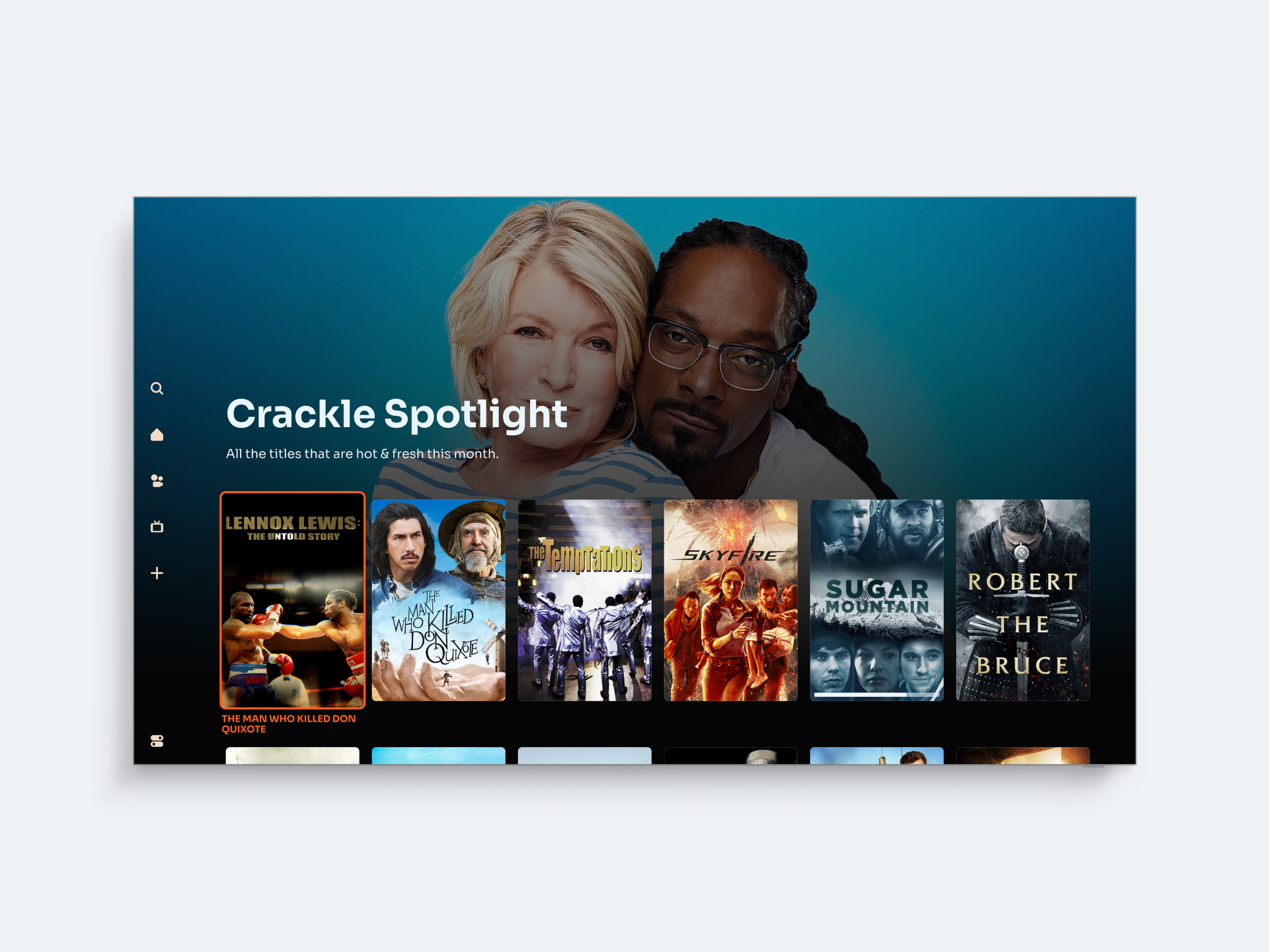
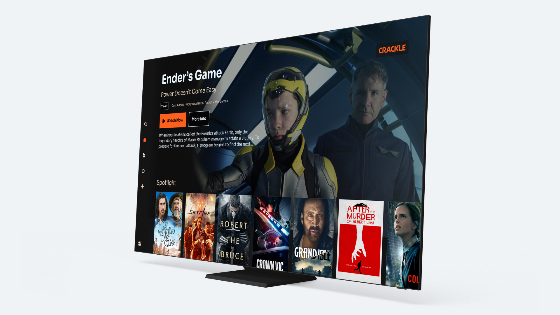
When the streaming market began to heat up with major players like Netflix, Apple and Disney+ all improving their services, Crackle knew it had to refresh its services. Offering free movies and TV shows with ads not subscription fees, a UX development and design overhaul with a focus on content discoverability would achieve the refit.
Want to watch your favourite Hollywood movies for free? Crackle has it covered. Based in the US, Crackle is one of the largest ad-supported streaming services (AVOD) in the US and brings movies and TV shows to fans. Its Roku channel was originally launched in 2011 and, by the time we were introduced, already had a large, established fanbase.
As the years went on, competition in the streaming market grew fierce and consumer expectations driven upward. The market began to see a sharp increase in interest for AVOD services, as consumers felt wary of being locked into too many subscriptions. Netflix, Hulu and Amazon Prime were all growing significantly, with Apple TV+ and Disney+ also entering the market.

Crackle’s Roku needed to stay competitive with its UX, a wider content selection and a fresh design. To make that happen, UIC Digital was asked to help give the application a total refresh, bringing development support to Crackle’s UX and UI teams for sprucing up accessibility and content discoverability, as well as creating a smoother viewing experience that kept the limelight firmly on the content.
Giving fans the VIP treatment
Our first step was to get a gauge on all the challenges Crackle was facing. We analysed all the data we could scrape, alongside industry trends, behaviour insights, reported pain points and opportunities for new features. We often use this approach to drive the best results for clients because we recognise the importance of data and customer insights in making key design, product and development decisions. Not only is user experience critical to any product’s eventual customer rating, but retrieving user feedback to inspire phases of testing and learning is also an integral part of our production process.

We developed Crackle with an iterative approach, first working towards an MVP with parity to its existing in-market Roku app. It gave us fast access to user feedback in a real-world setting, a process which was then baked into a regular release cycle so that the Roku channel continually improved in response to user needs.
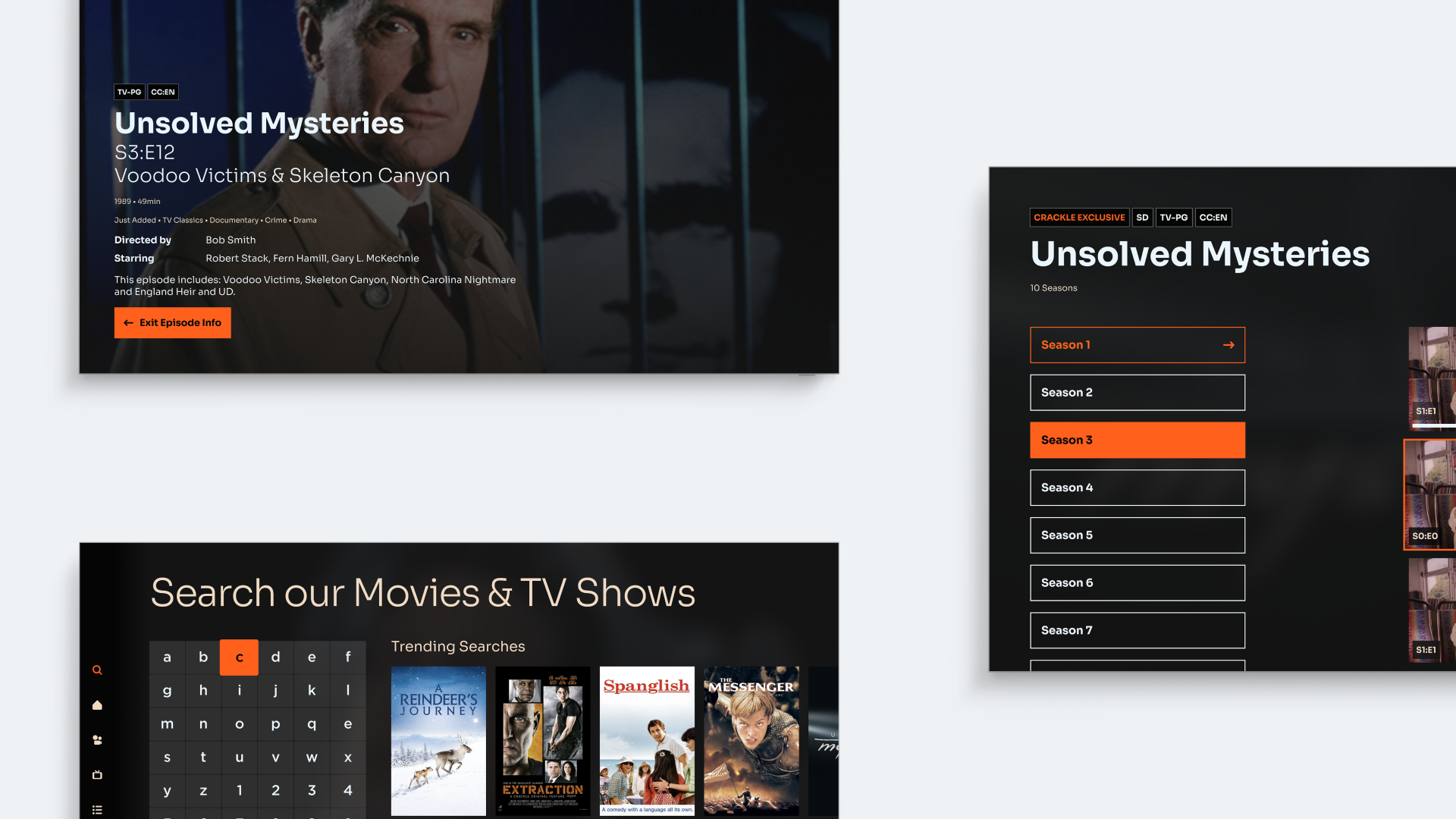
One of the areas we identified was the opportunity to create a more intuitive user experience to make finding content easier. The UX needed a better search functionality, for all those times you just can’t decide and end up watching Miss Congeniality for the seventh time. The search would include better recommendations too, a more detailed process and entry into a better catalogue browsing experience to combat scrolling fatigue. We also added the ability for users to create their own watchlists, as is now the norm on most streaming services, bringing Crackle onto equal footing with its competitors and satisfying user expectations.

A box office hit
Crackle’s updated Roku channel is modern, user-friendly and far easier to navigate, so users can get stuck into their popcorn or binge watch their favourite show much faster. The results have been blockbuster. Video start times have improved by 42% and, in turn, viewership has risen by 40%. Ad exits – an important metric for Crackle – dropped by a whopping 200%.
These are box office numbers that make Crackle one of the leading players in the streaming service space. Now, important decisions: sweet or salted?
What Crackle said:
Philippe Guelton, president of Crackle Plus, said: “Our team is excited to release this new version of the Crackle app onto Roku devices that have traditionally been a large share of our audience. We are now presenting our premium content offering into a totally redesigned and faster loading experience, which has proven to deliver higher engagement and user loyalty with each new app release.”

